MCI Academy

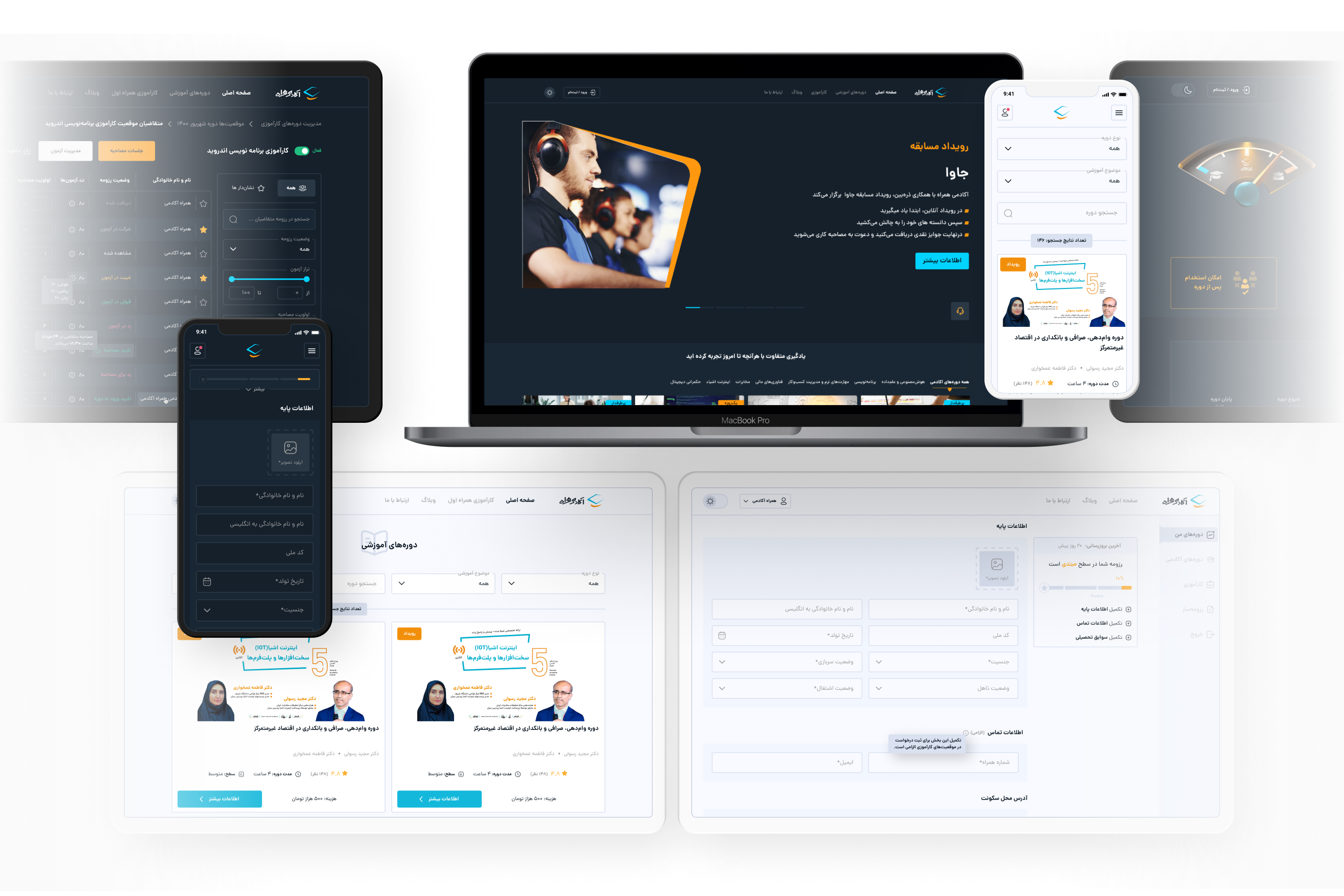

 Problem Statement
Deliver relative online educational courses to the users.
 Solution
A basic LMS to help users find the fittest courses for them and take them easily.
 Design Process
- Creating usability issue list by heuristic evaluation and one to one usability test
- Prioritize issues and solutions
- Design and develop
- Daily check website heatmap and user recorded sessions
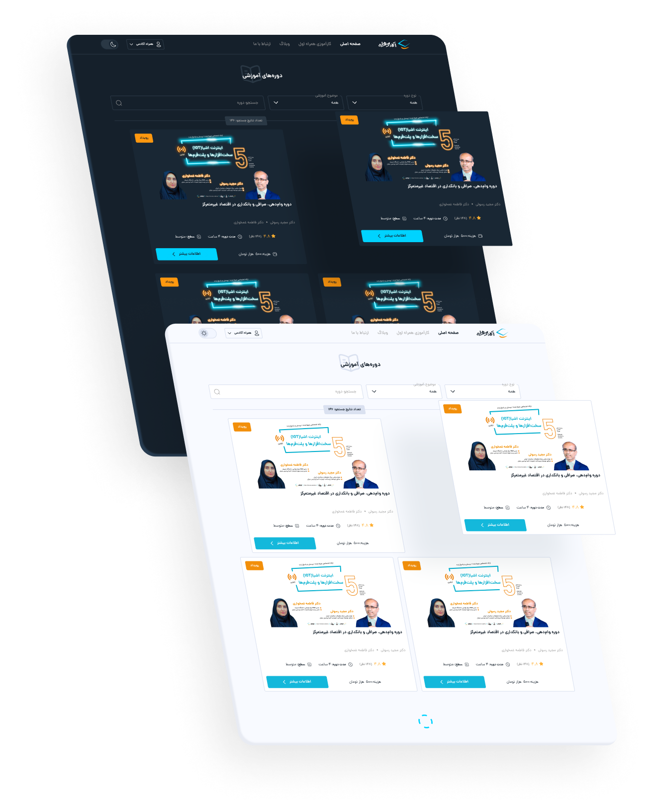
 Usability Issue List
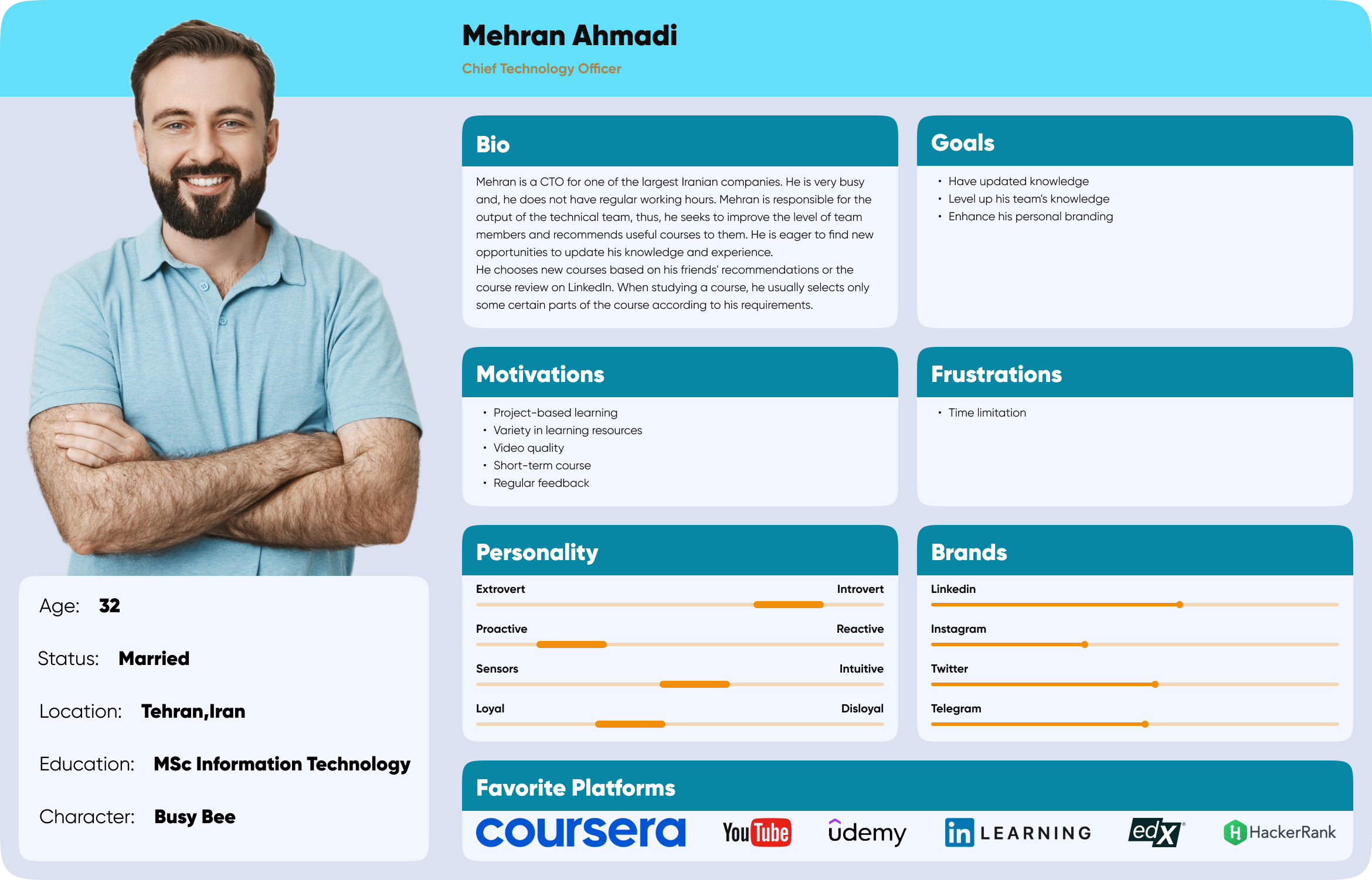
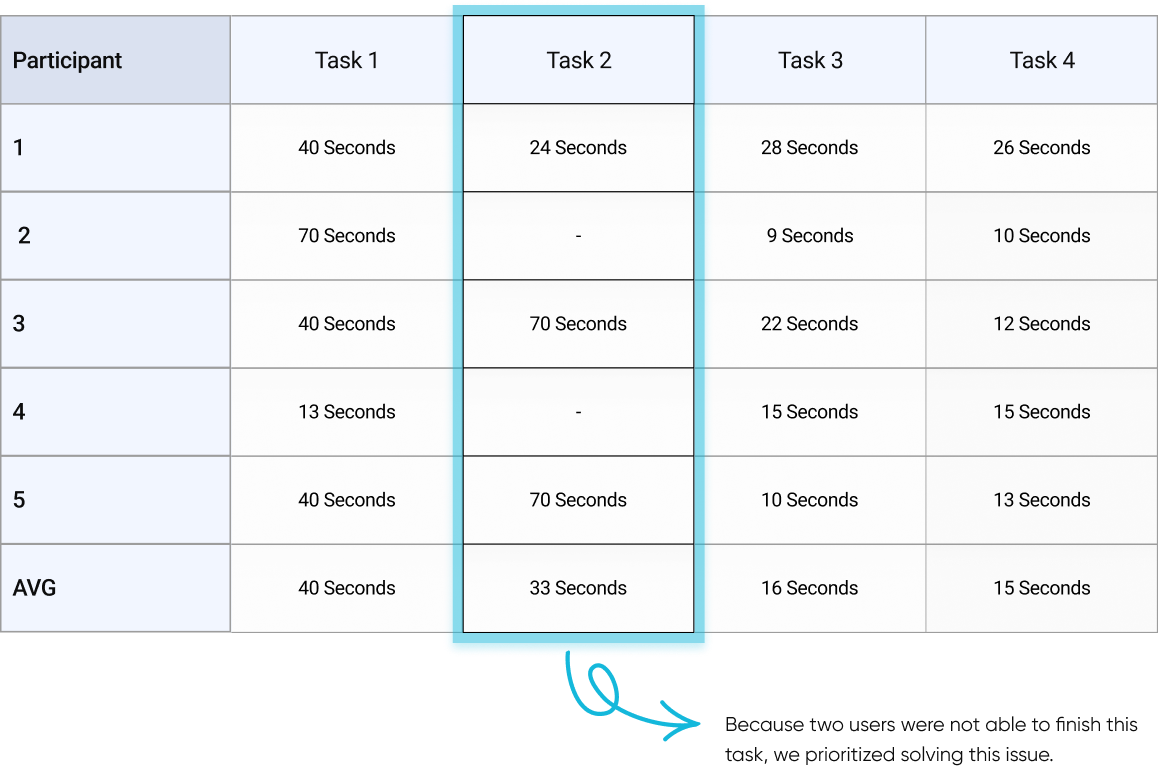
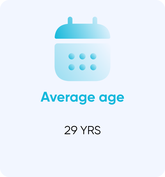
We started the process with Summative usability testing to understand current problems. Based on its results, we used affinity mapping to determine priorities. Finally, we created task flows. To uncover pain points while using the website, we conducted five remote usability tests on Skype. The selected users were reasonably close to the product's personas. Two of them were students, four of them had not used MCI Academy in the past. We gave each user three scenario-based tasks within the website:
- Check the information of course X and enroll in it.
- Register for the free part of course X and watch it.
- Increase your online credit on our website.

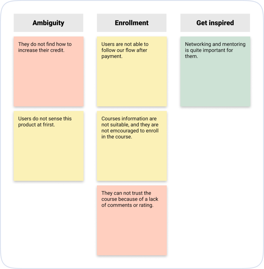
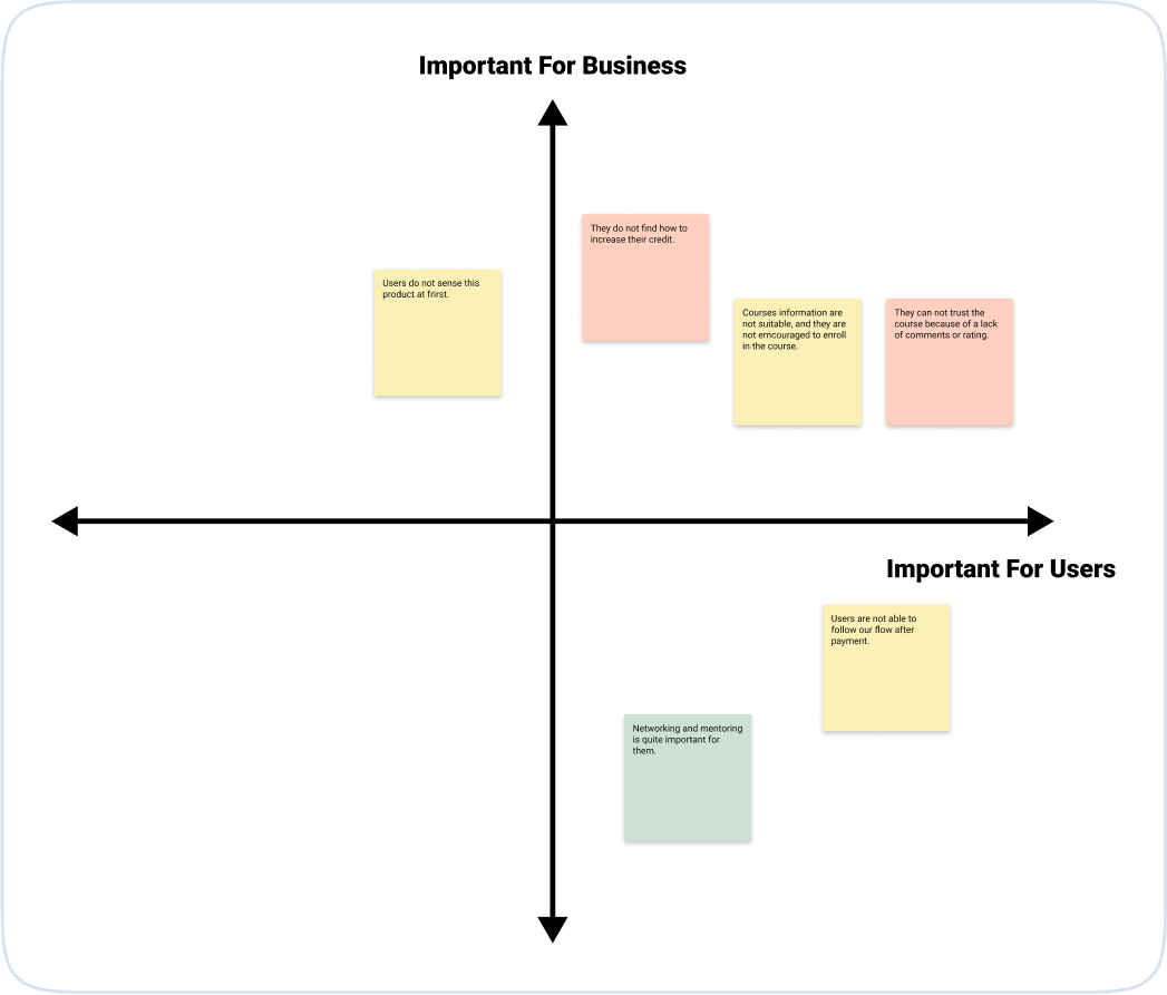
Based on our usability test, we decided to focus on the following four problems:
- credit increase
- course's information
- user flow
- homepage

 Quantitative Analysis
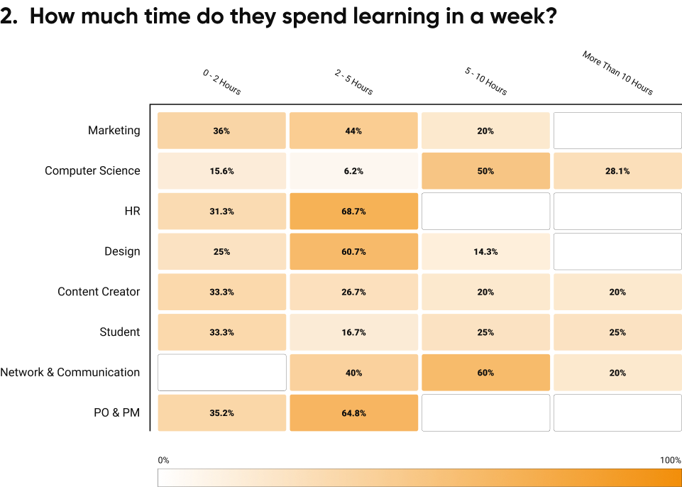
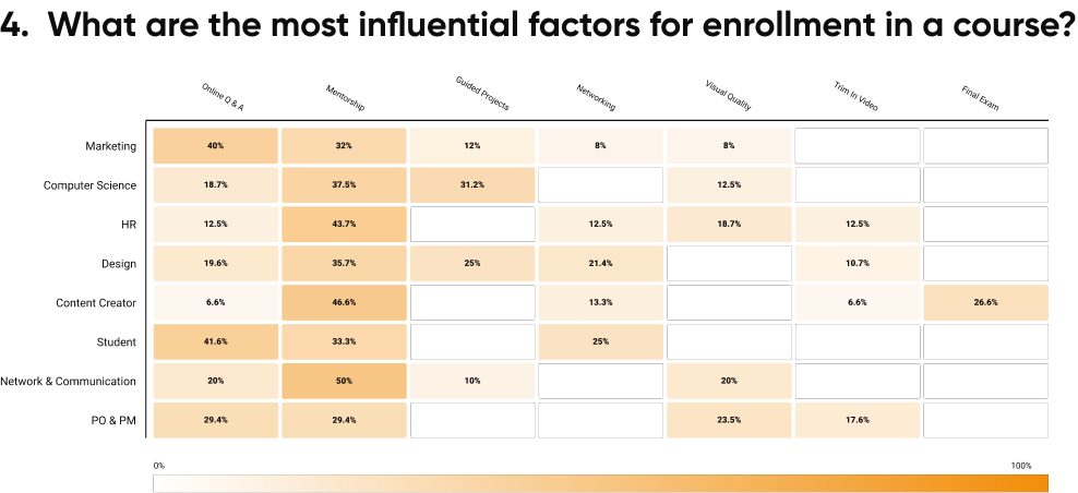
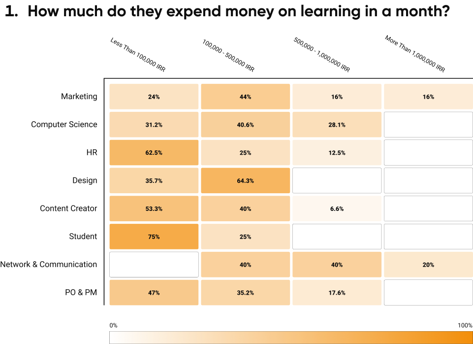
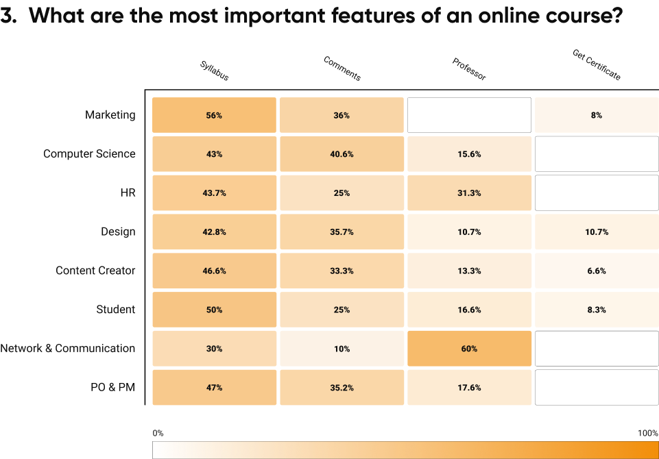
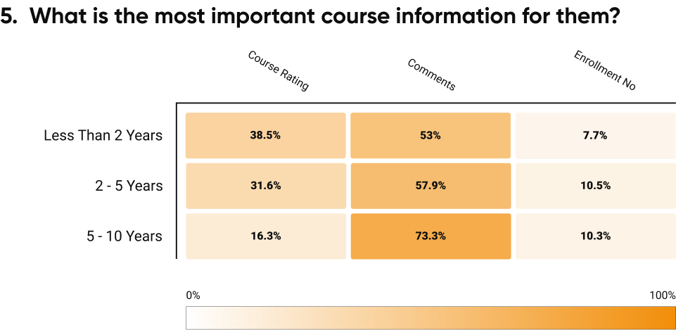
We had a session with other teams to discuss users' problems. All teams were aligned that we should change multiple parts of our product, therefore, we decided to conduct a quantitation analysis. We prepared a survey, and 150+ participants answered it. Important points extracted from the survey are as follows:

 Competitive Analysis
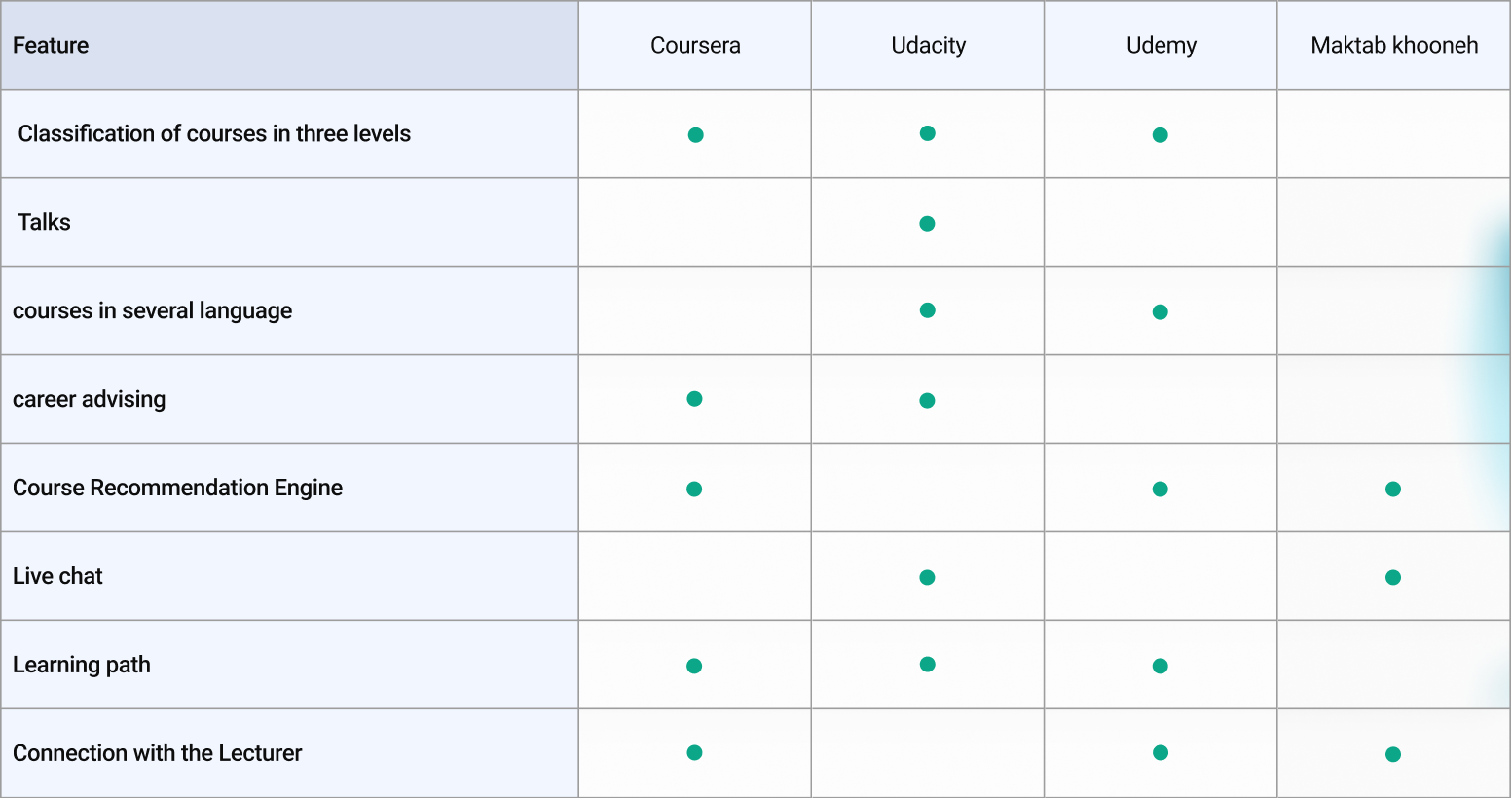
Based on the design thinking approach, in the first phase, we tried to empathize with our users. Therefore, after user research, we investigate exciting products on the market. We checked users' reviews of those products to find out important factors for users. This will help us to better decide what features we should bring and how to enhance the user experience.


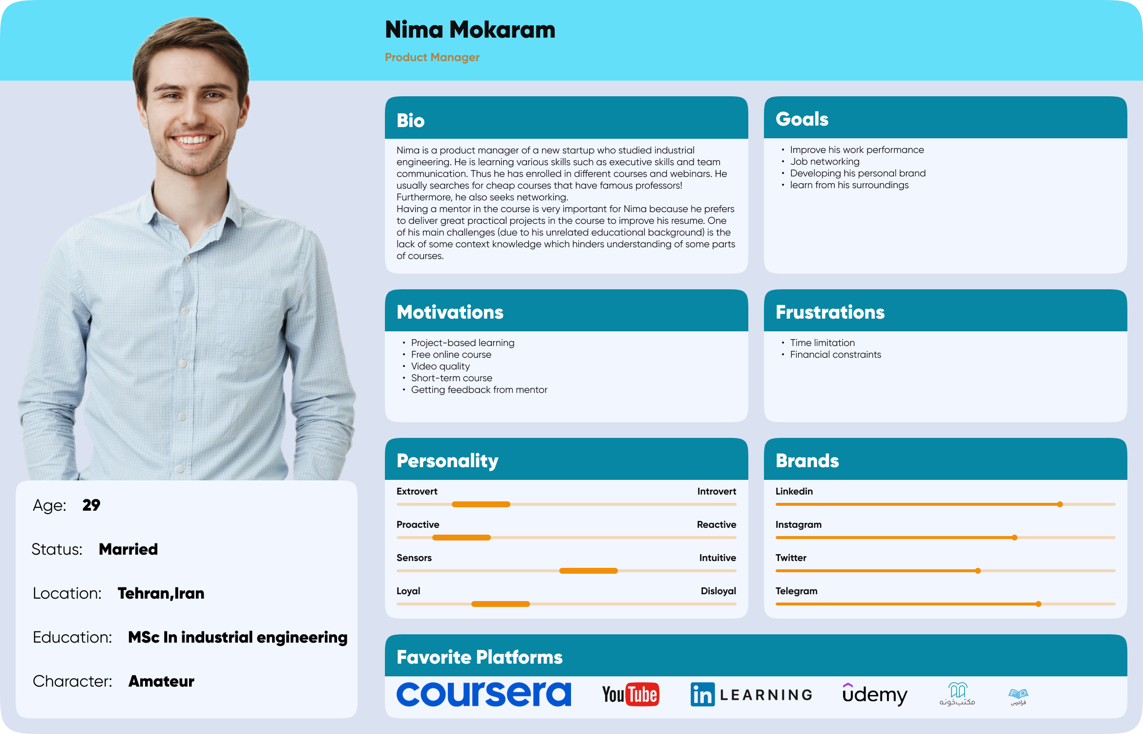
 Persona

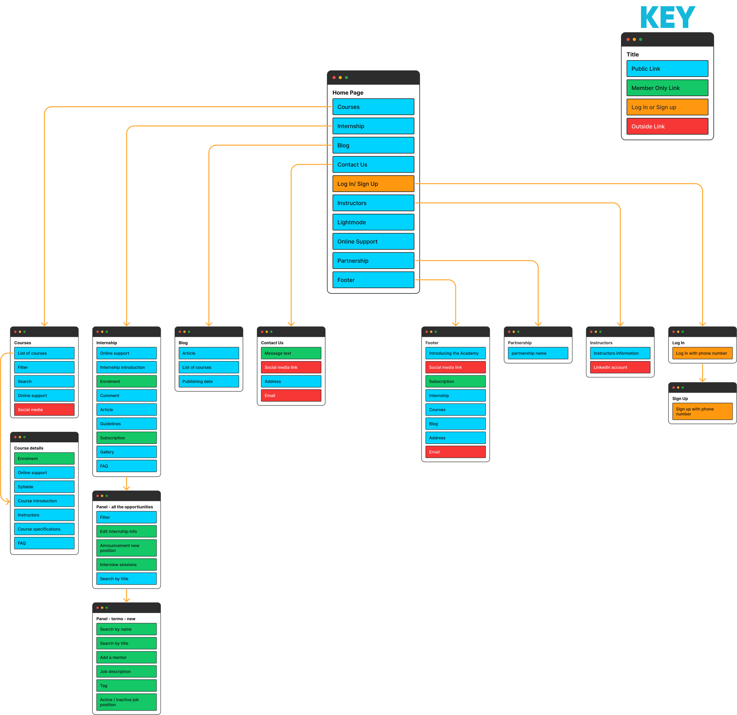
 Sitemap


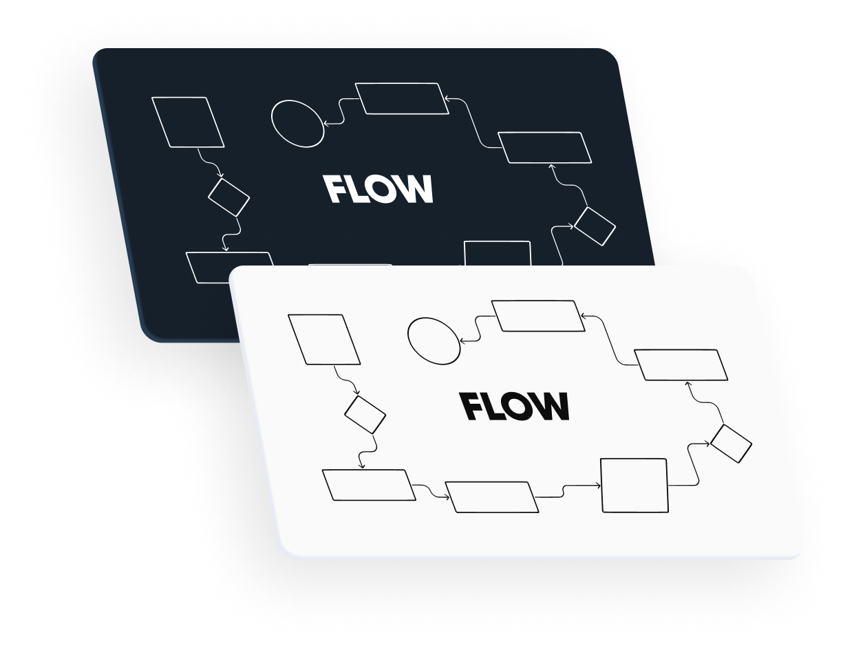
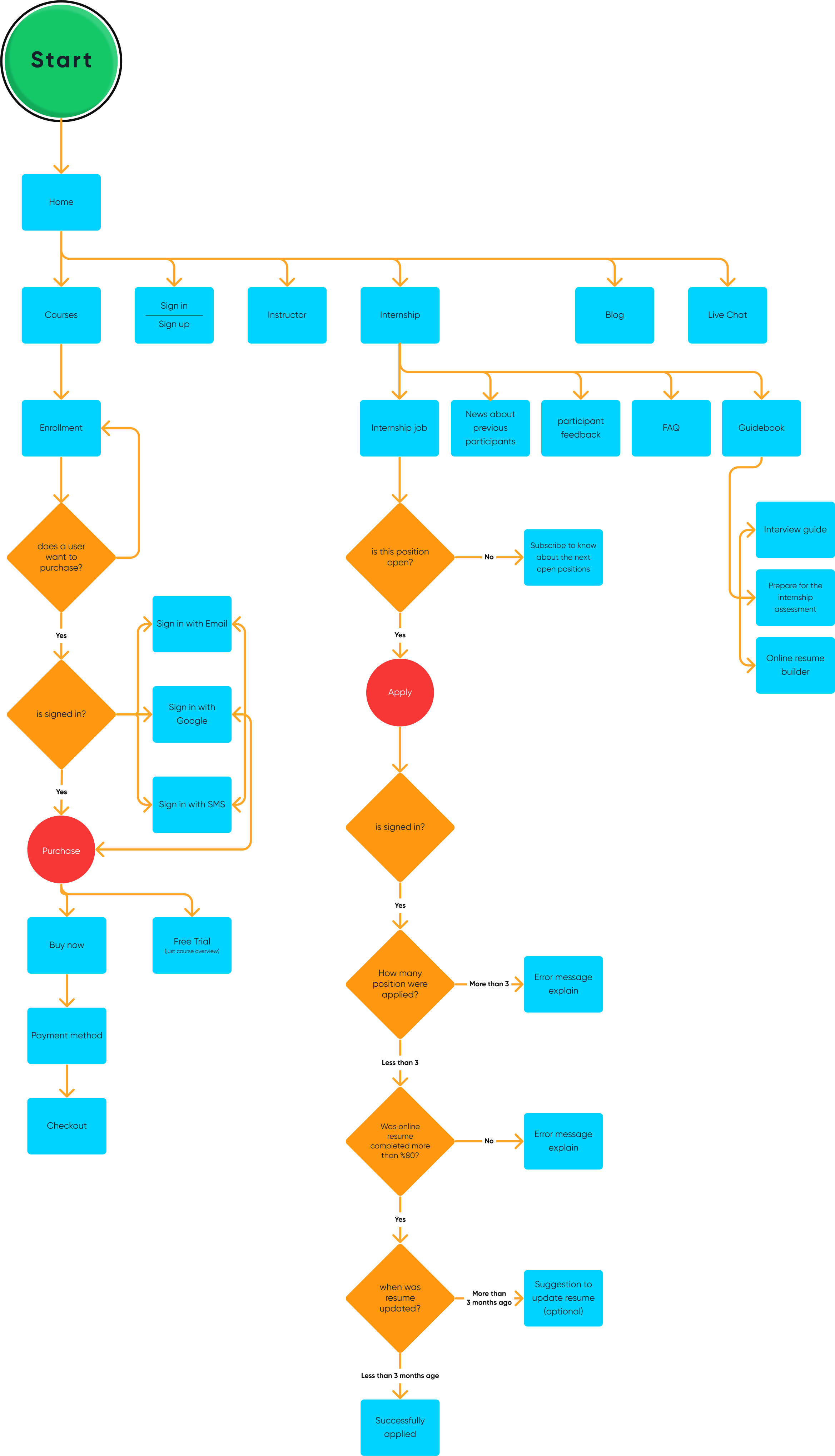
 User Flow
- Design and develop the first version that contains three categories of the test (math, English, and general questions)
- Trying to stabilize the exam process
- Design and develop a comprehensive exam builder platform


Before delivering mockups to developers, I evaluated the effectiveness of our design.
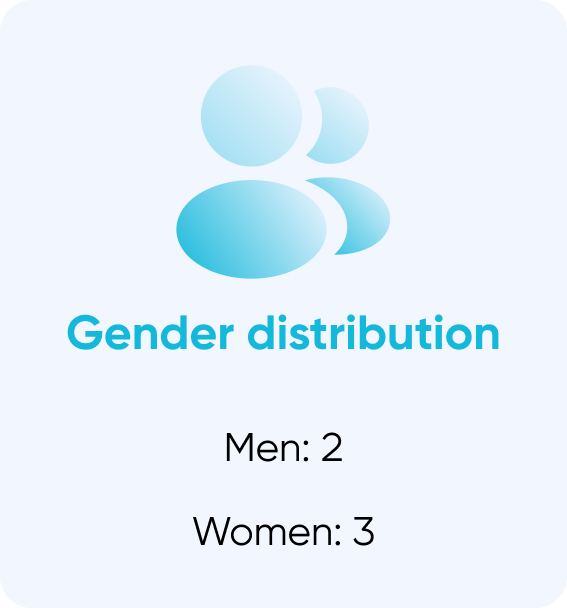
Participant scenario:- Create an account and fill out your profile
- Set your learning goals
- Leave a review for each course that you passed more than 50% of it.
- Enroll in a specific course
Pain points:
I did not figure out the "Talk" section, I supposed it is a podcast but it was not correct.
I could not edit my name in the profile.
I was not able to find easily how to set a learning goal.
When I left a review, I expected that it automatically save my information for the next times.
I wanted to search the course's name but I could not find a search box.
I did not understand the difference between "My course" and "My class" sections.
Positive feedback:
I was delighted with the Home page redesign.
Being able to rate is very important for me and I was glad that you have added this feature.
I can see the instructor's resume quickly on LinkedIn.
I was attracted to your new internship program.
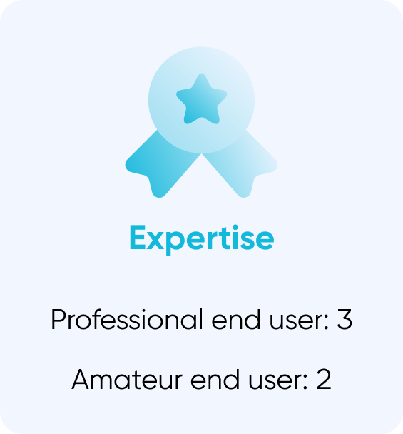

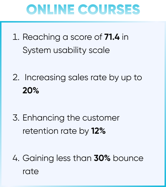
 Microsoft Clarity
We analyzed the user behavior using Clarity. That gives us valuable insights into how people are interacting with our website which significantly helps us in finding their pain points. Also, we monitored core KPIs that were determined in the Benchmark phase.

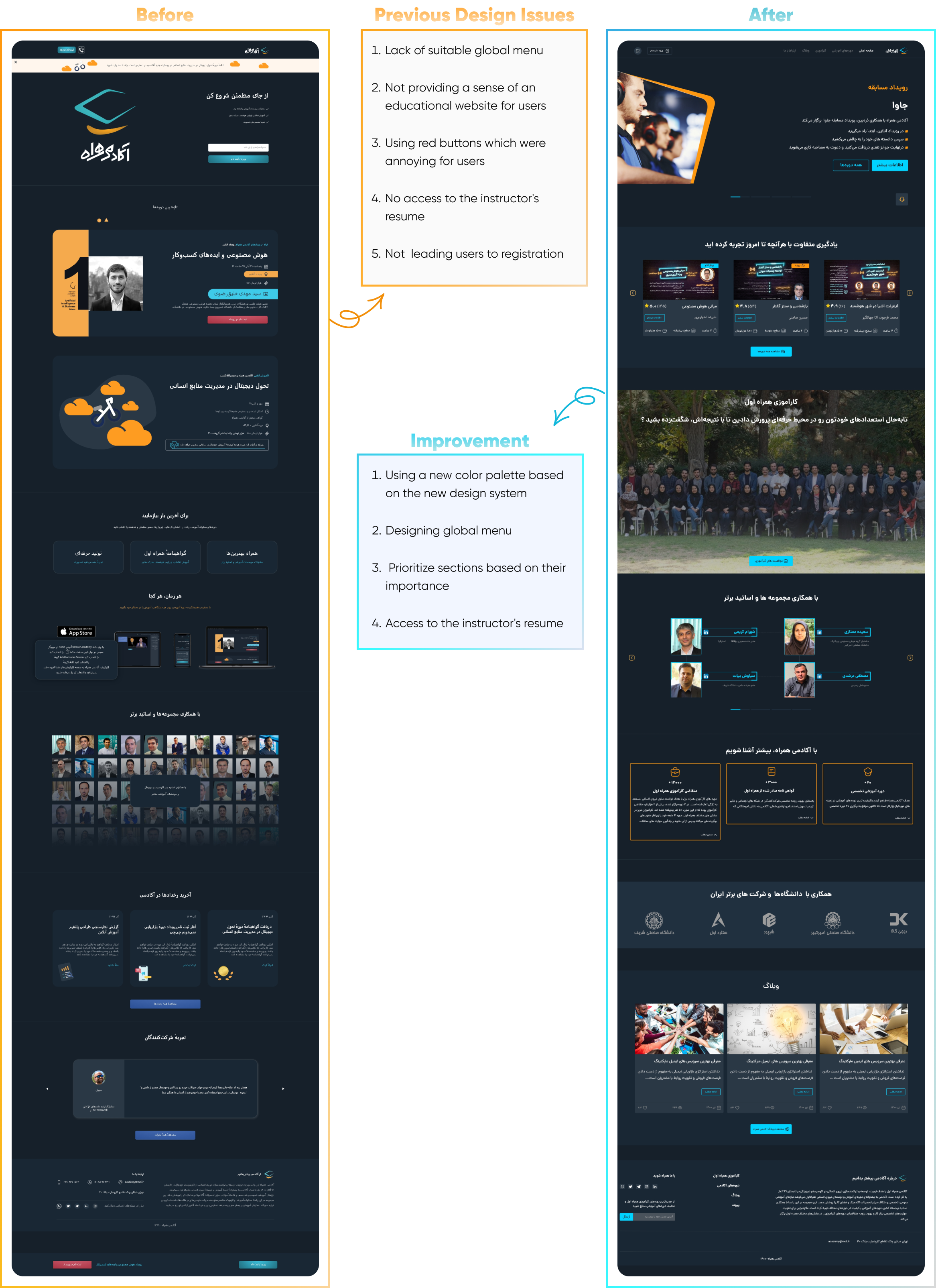
 Homepage
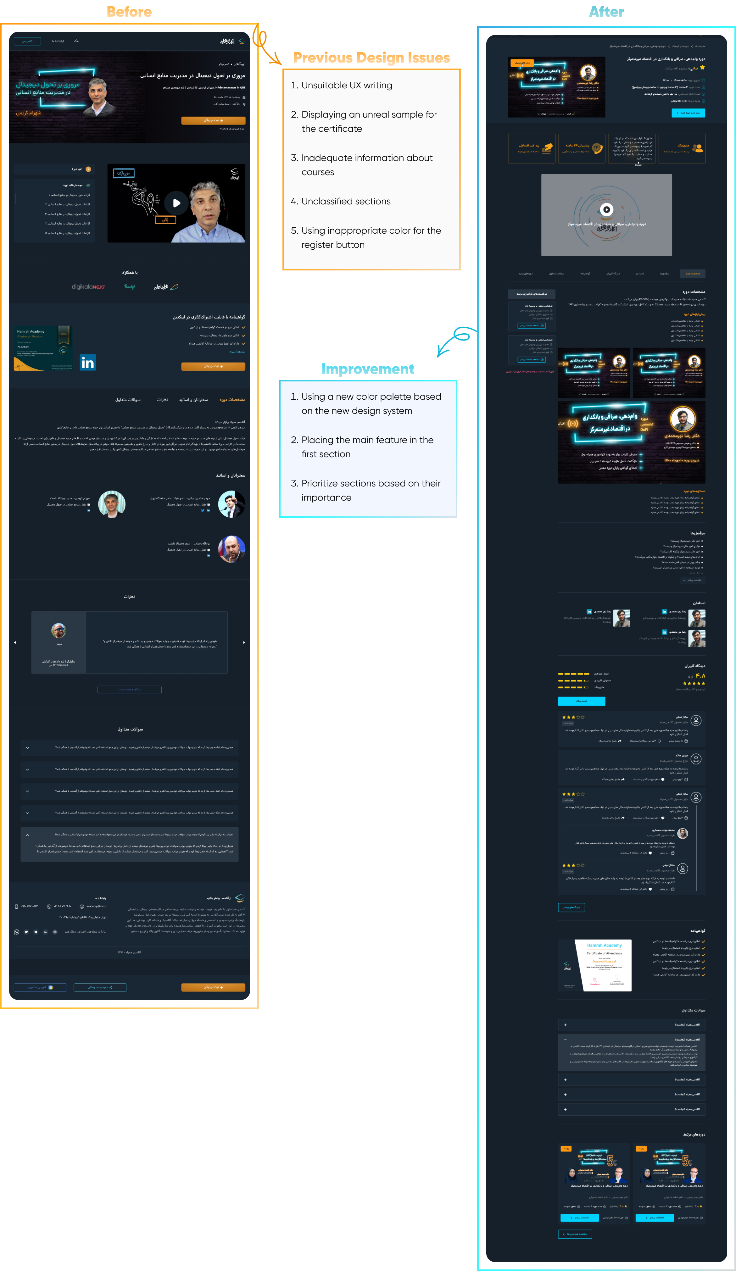
 Course Information
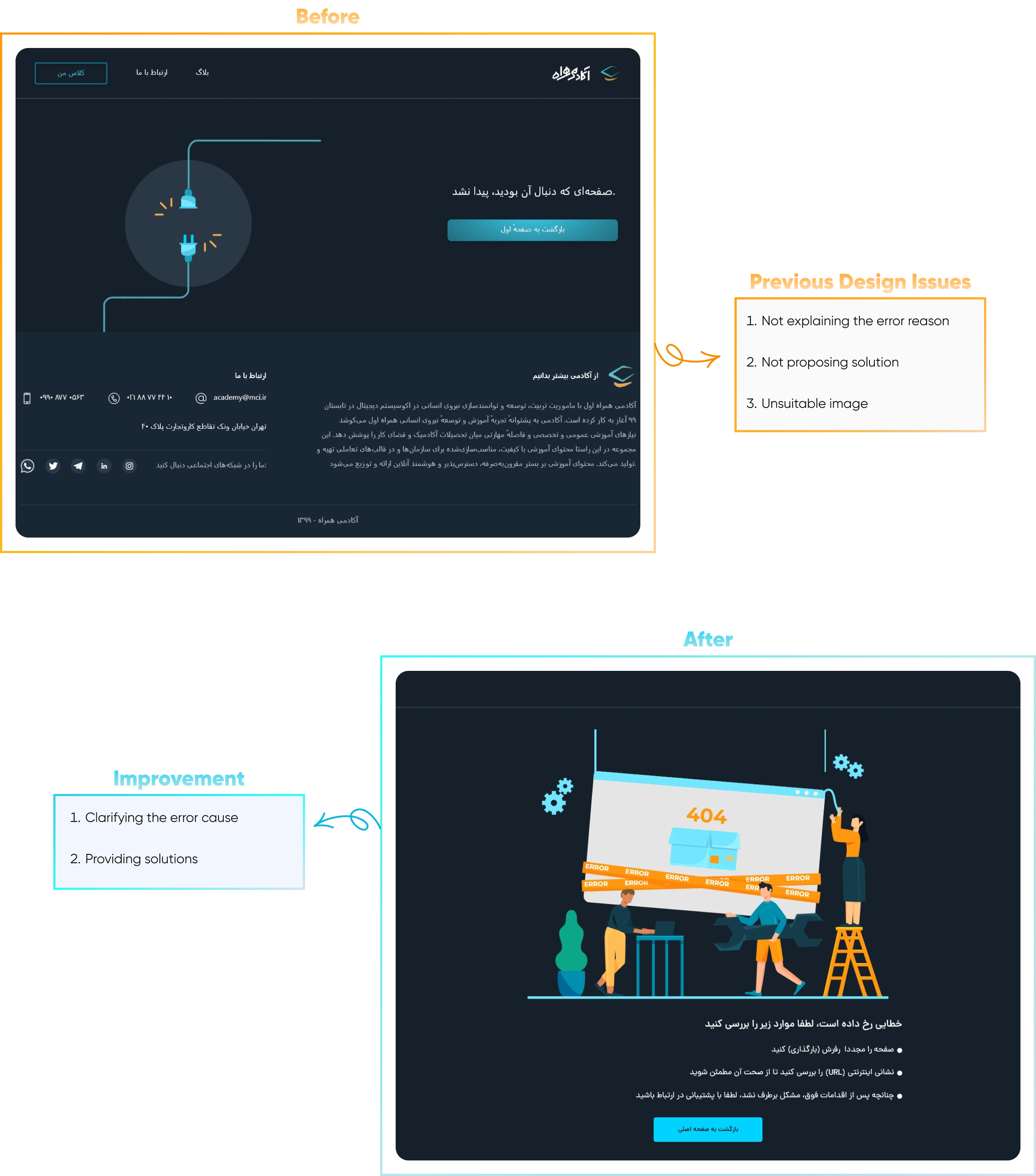
 Error
Error

 Problem Statement
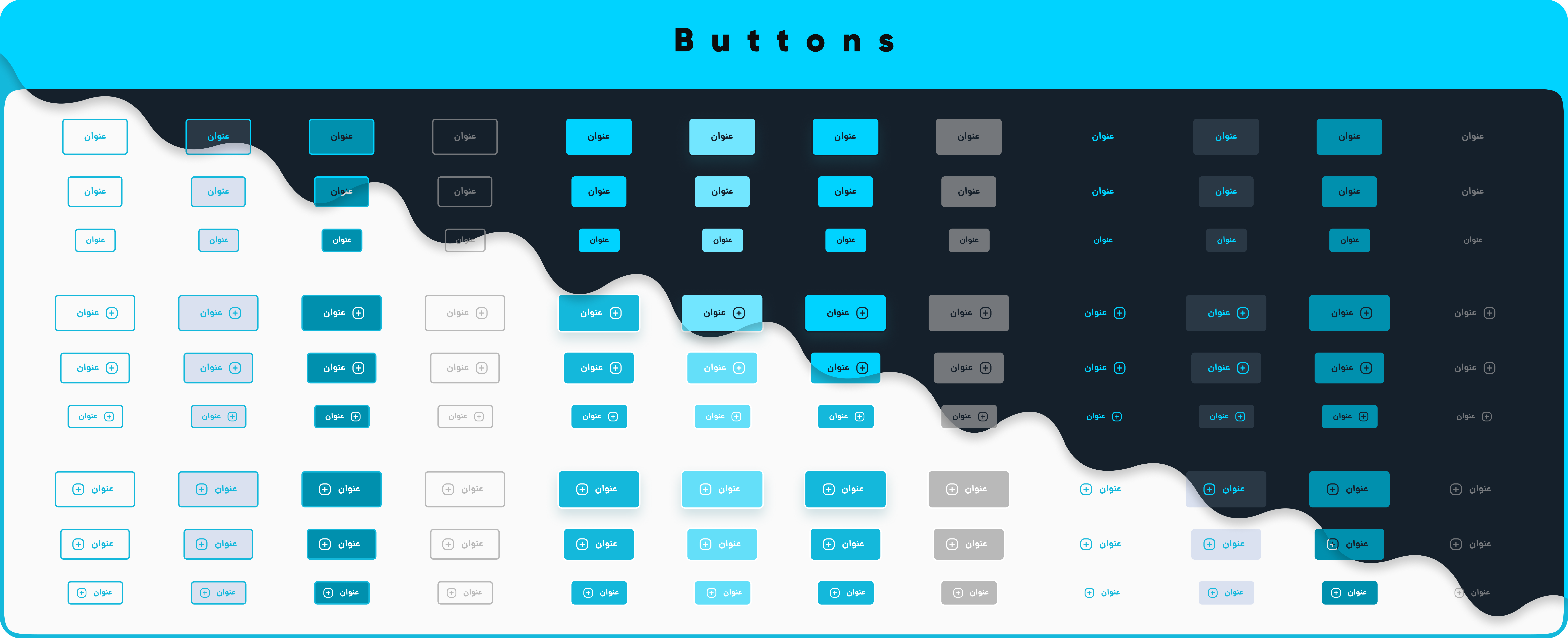
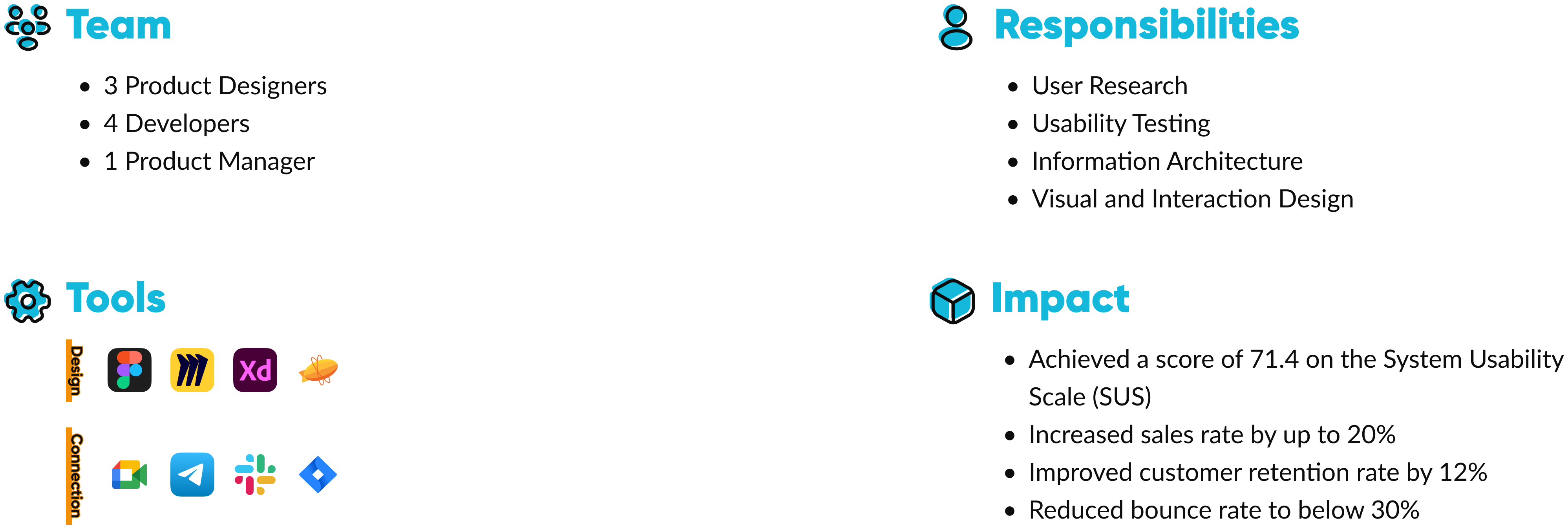
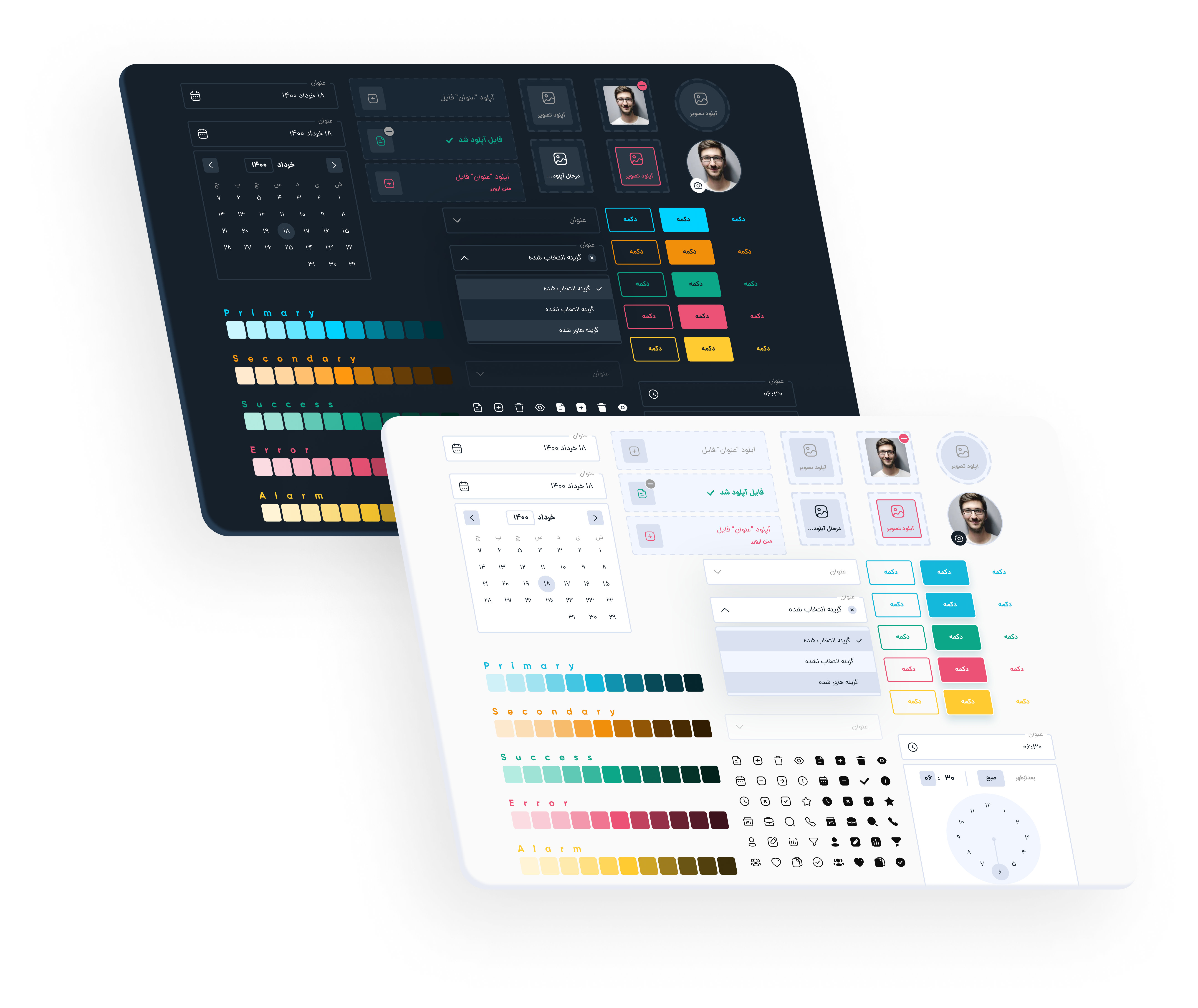
We were an agile team with 4 developers. We were trying to design products in our team as quickly as possible and consistently so we decide to design a single source of truth for our style guide, main component, and design process to empower our design and development team.
 Solution
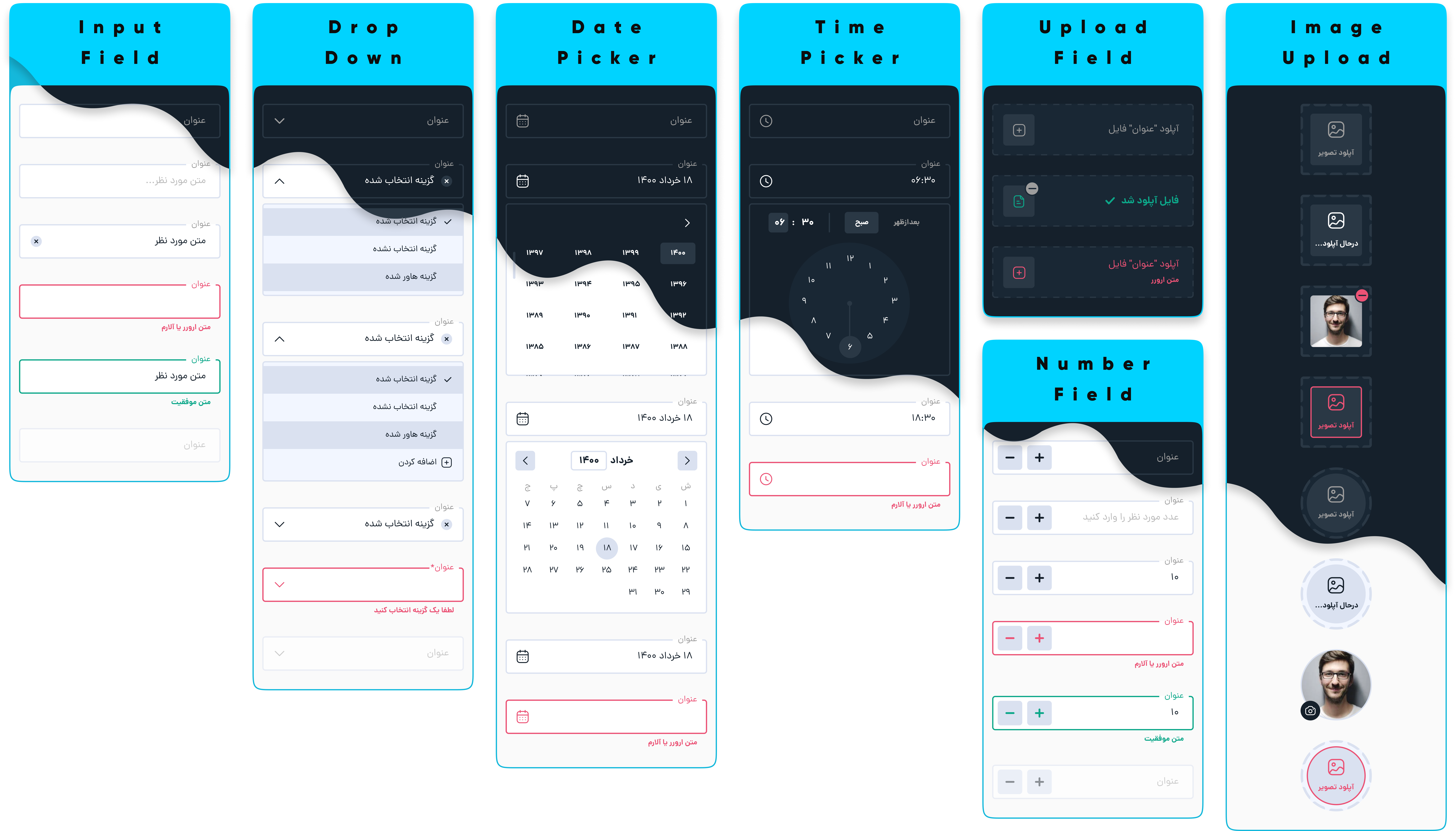
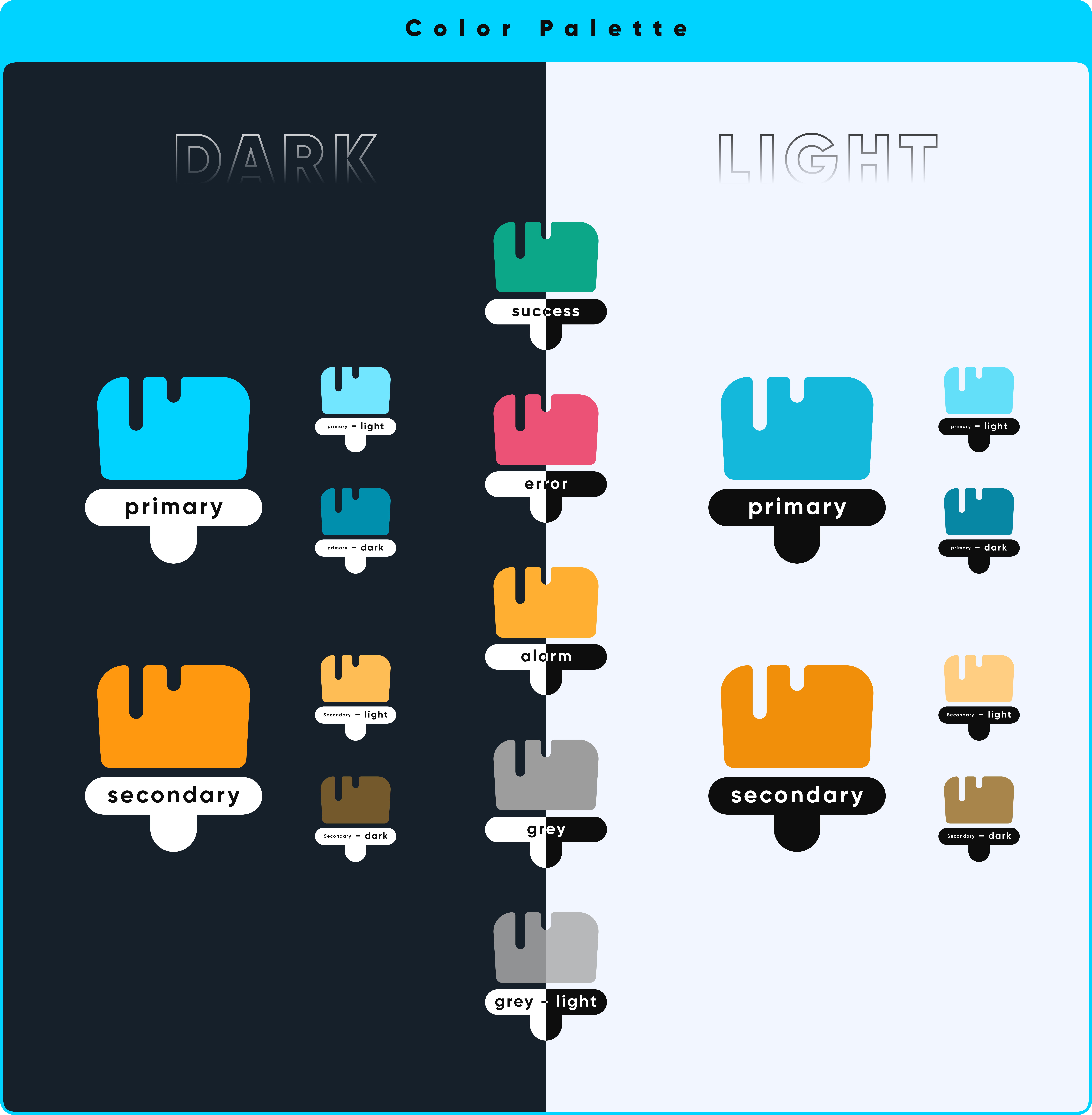
The solution was simple first we decided to put the style guide together to have a consistent style guide after that we design a simple UI Kit in Figma then we document every step of the design process and deliverables for teams.
 Design Process
- Create a list of usability issues by checking inconsistent pages, site heatmap, and user session recordings
- Choose a design tool (Figma) and set the style guide
- Design a simple UI Kit
- Document Design process and deliverables
